Wallpaper in Bathrooms and Kitchens: Myths, Truths, and the Ultimate Material Guide
February 27, 2026
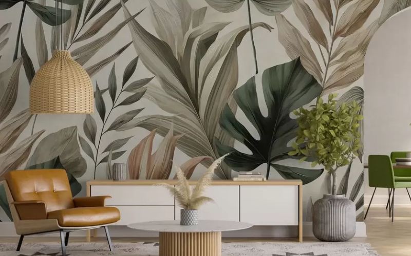
2025-2026 Interior Design Trends: The Rise of Biophilic Style and Botanical Murals
February 27, 2026
The Art of Visual
Cohesion Entering a professionally designed room feels effortless, but behind that sensation lies meticulous science. One of the greatest challenges in luxury renovation is the transition between surfaces. Once you have selected a breathtaking wallpaper at Empire Wallpaper, the next decision is critical: What color should I paint the remaining walls, trims, and ceiling?
The answer lies in the synergy between Benjamin Moore’s pigments and the textures of our papers. It is not just about "matching"; it is about creating a visual dialogue that alters the perception of the space.
The "Accent Color" vs. "Enveloping Effect" Strategy
As experts, we recommend two primary approaches based on your design goals:
- The Third-Color Approach: Look closely at your wallpaper pattern. Ignore the background color for a moment and find a secondary or even a tiny detail (a small leaf, a metallic line). If you choose that color for your Benjamin Moore paints, the wallpaper will "pop" immediately. For example, a paper with a cream base and Hale Navy details will look incredibly luxurious if you paint the moldings in that same deep blue.
- The Monochromatic Effect (Cocooning): Very popular in libraries and master bedrooms. This involves matching the paint color exactly to the background of the wallpaper. This eliminates visual lines at the corners, making the room feel infinite and extremely cozy.
Applied Psychology for Every Room
Color dictates human behavior within a room. When combining textures and paints, consider the following:
- Bedrooms (Serenity): We recommend soft botanical papers with Benjamin Moore paints in tones like Quiet Moments or Pale Oak. These colors lower the heart rate and prepare the mind for rest.
- Studies and Offices (Productivity): Deep greens and blues (like the famous Gloucester Sage) promote concentration and reduce eye strain. Combining a natural fiber wallpaper (Grasscloth) with these tones creates a modern "English study" atmosphere.
- Dining Rooms (Drama and Conversation): This is where you can take risks. A metallic wallpaper paired with walls in dark tones like Salamander or Black Abyss creates an intimate, sophisticated environment under lamplight.
Why Pigment Quality Matters
Not all paints are created equal. High-end wallpaper has a depth of texture that budget paints cannot accompany. Benjamin Moore’s Aura line uses waterborne colorant technology that offers a richness of color that does not fade and has the "body" necessary to stand alongside a luxury wallpaper.